
Exploration of the relationship between type and image, taking into account both the historical context of the typeface, its intent and physical characteristics. 10 different typefaces were selected that represent 10 distinct font classifications. A found image that relates to each typeface was paired with each font and a distinct design was created for each one.

Futura is unassuming yet assertive. Just like other designs that came out of the Bauhaus movement, the letters are stripped down to their basic function.
Fraktur was one of the first fonts to be used for mass producing books on a printing press. The font was designed to mimic ancient illuminated manuscripts created by monks. The development of the printing press allowed books to be more widely available to more people not just reserved for the wealthy. This new technology was the spark that spready many new ideas across the western world and changed the culture forever.
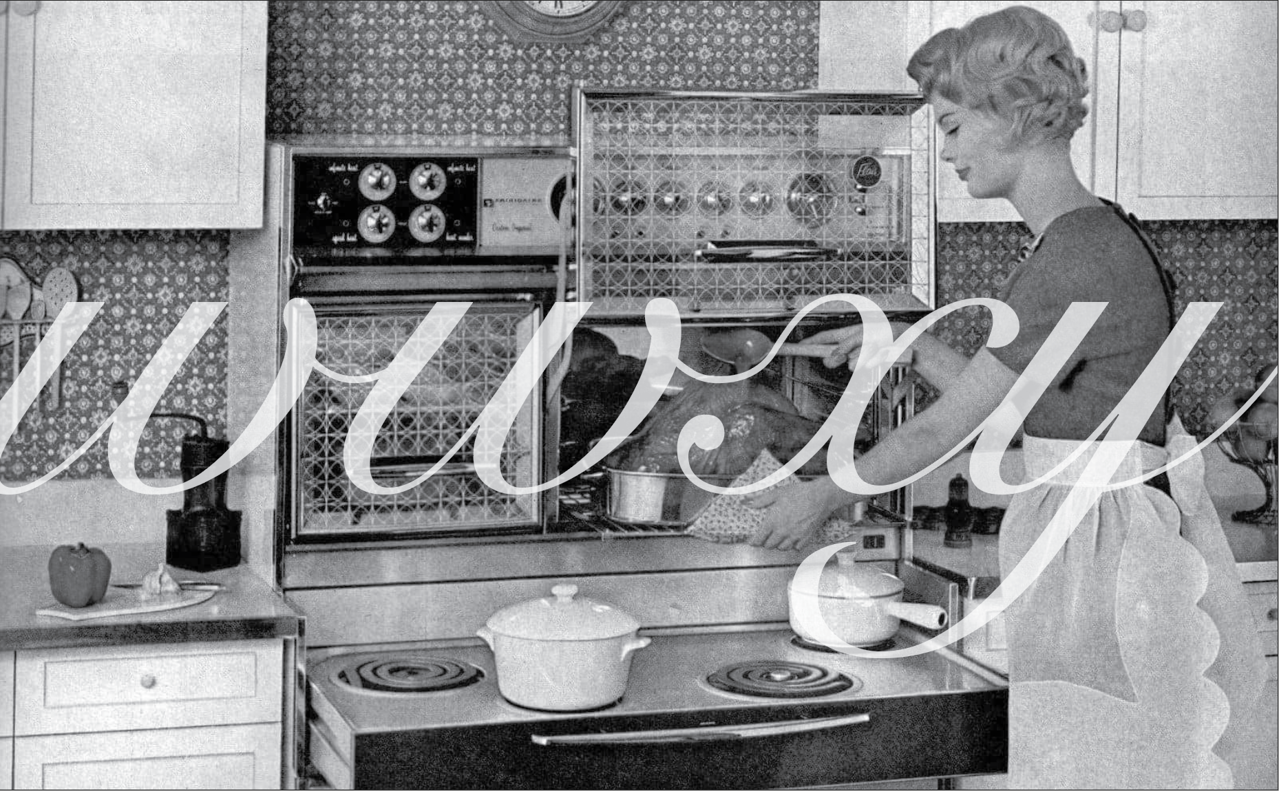
Snell Roundhand was intended to represent puritan principles of simplicity and efficiency. This is epitomized in the ideals of the traditional mid century housewife that was portrayed in advertisements at the time this font was created.
Silkscreen is a font made from pixels, it does not have any curves and almost appears to be made out of blocks.

Baskerville was born out of the Age of Enlightenment. It is a further refinement of Oldstyle with a nod to NeoClassical which was all the rage at the time. Engraving was a new technology allowing even more fluid lines, lighter brackets and more exaggerated thick to thin ratio.
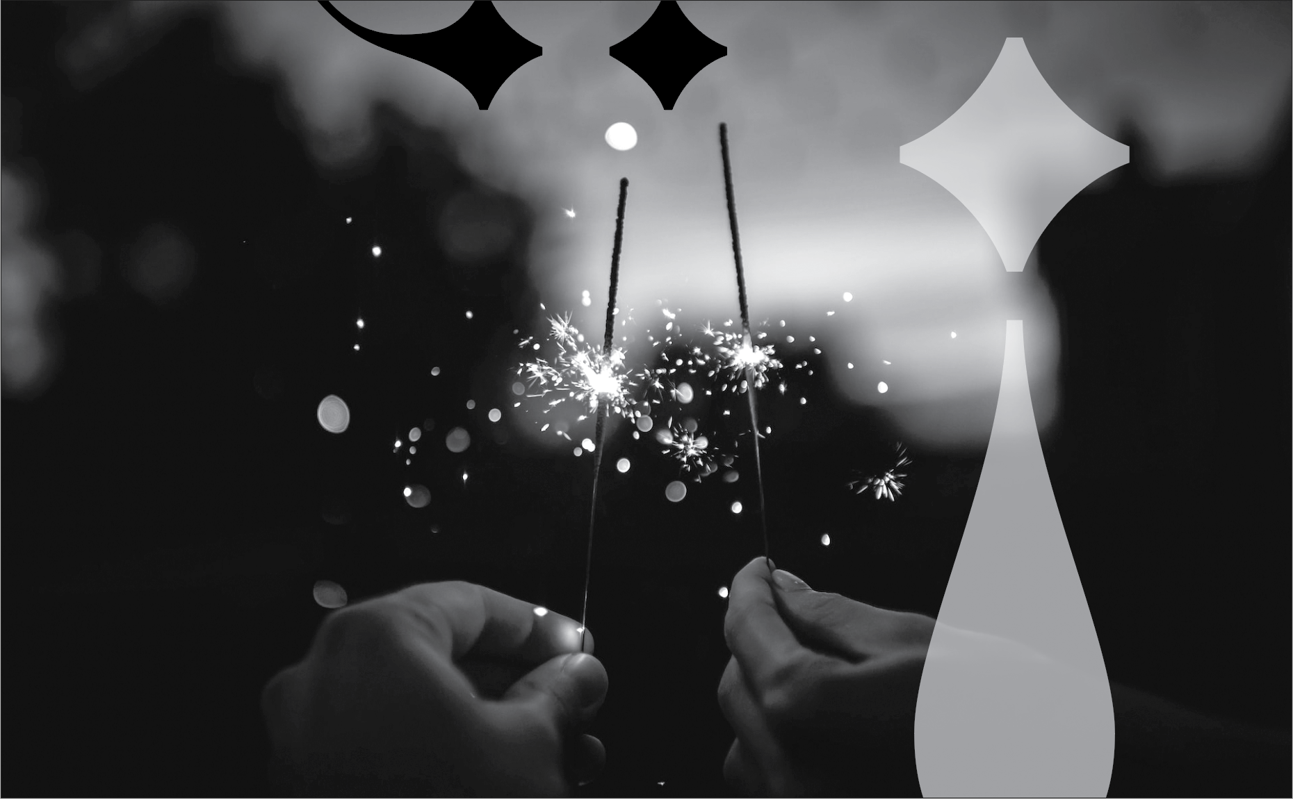
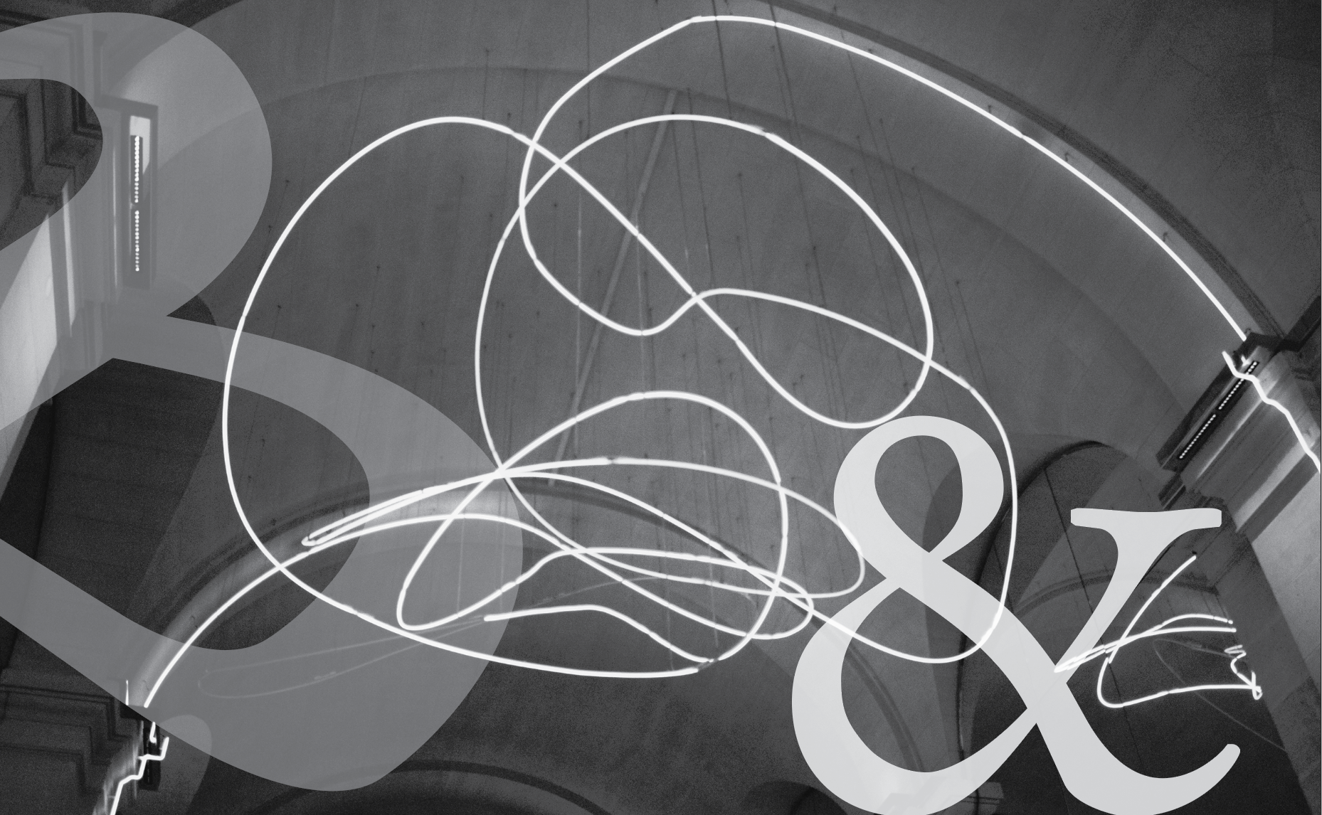
Syntax is a modern design with a hand drawn look. It’s approachable and comfortable.

Bodoni is sophisticated, delicate and inviting. It feels fancy but also is very appetizing like a lovely dinner party at your chicest friend's house.
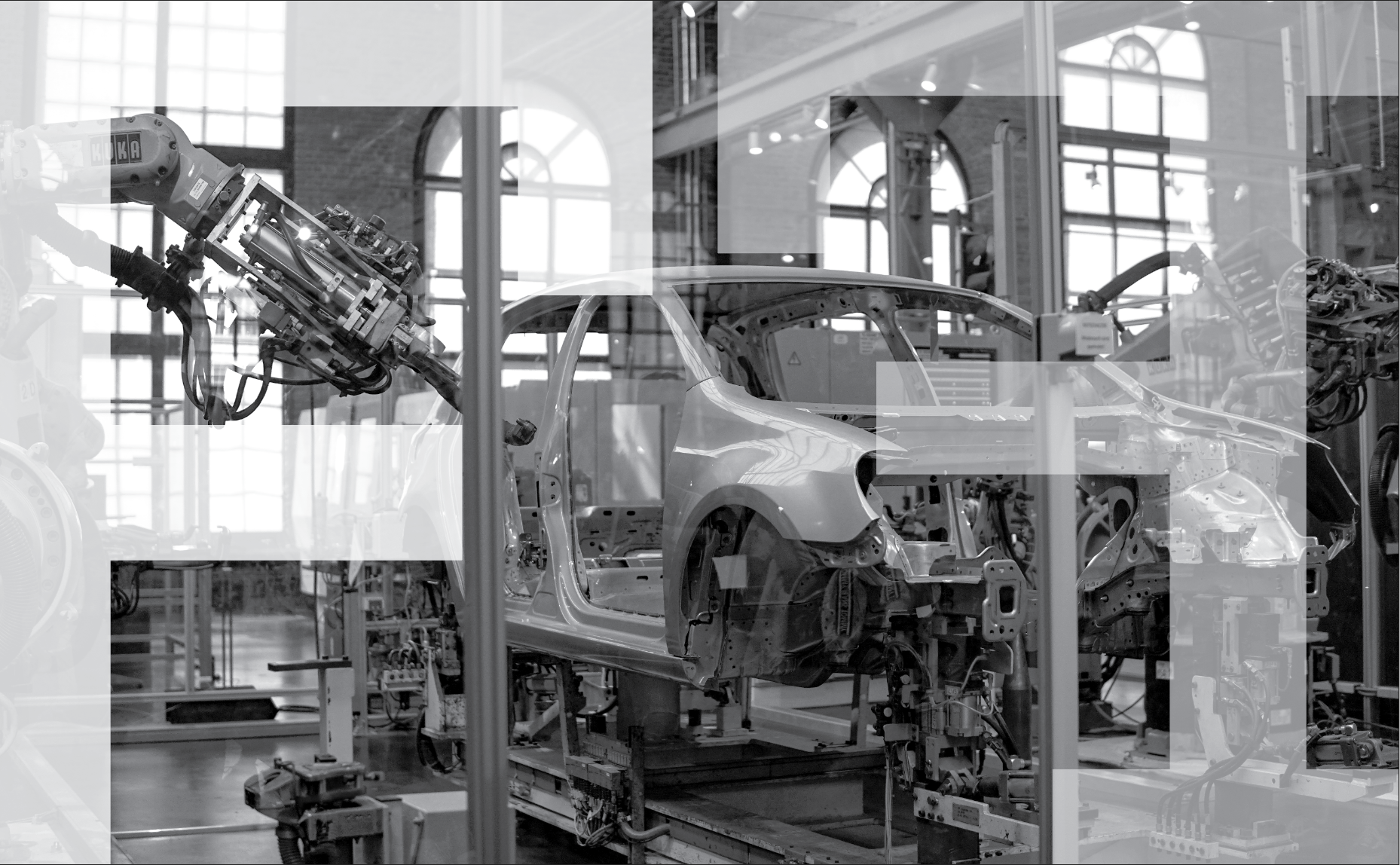
Rockwell is confident and utilitarian. It was created by former mechanic, Frank Pierpont and was used for advertisements. It was created at a time when factory produced goods were becoming more and more common and advertising was booming as well.
Garamond was created in France at a transitional time in history, the French Renaissance. It was a break away from the standard fonts at the time and was meant to resemble more the popular handwriting style of the time.
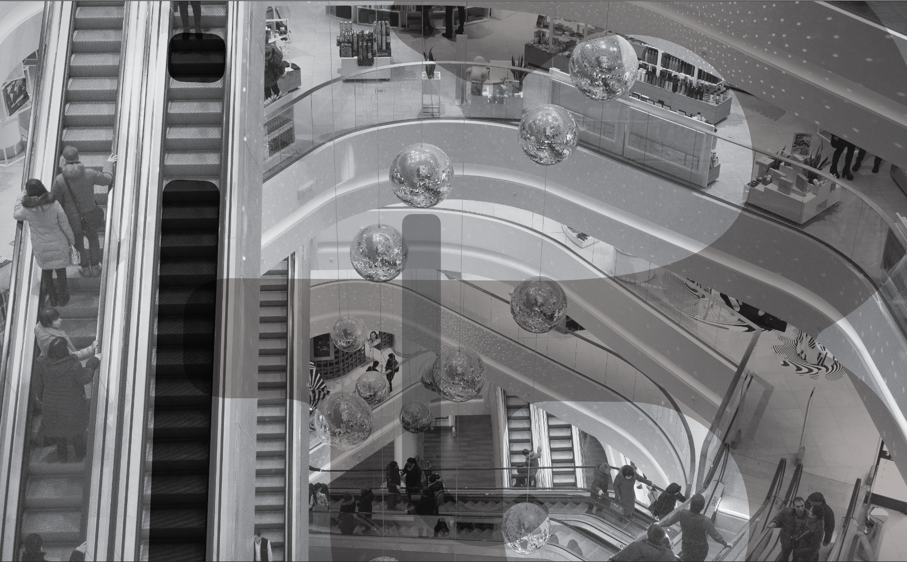
Platelet is a font that was created in the 90s and meant to be purely decorative.