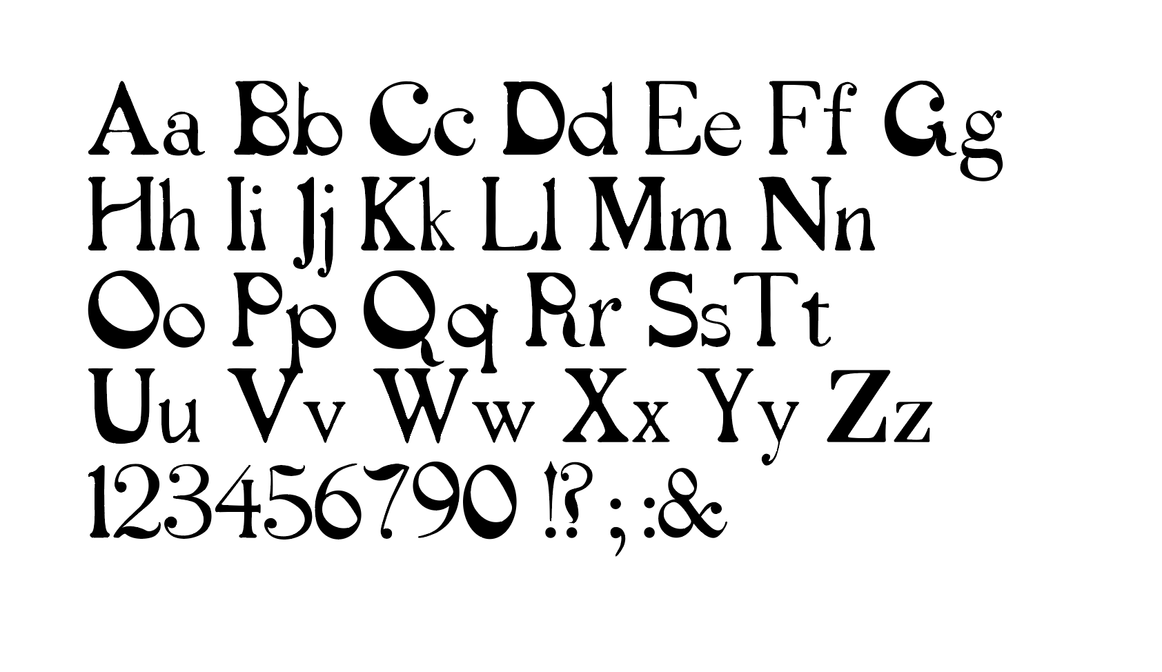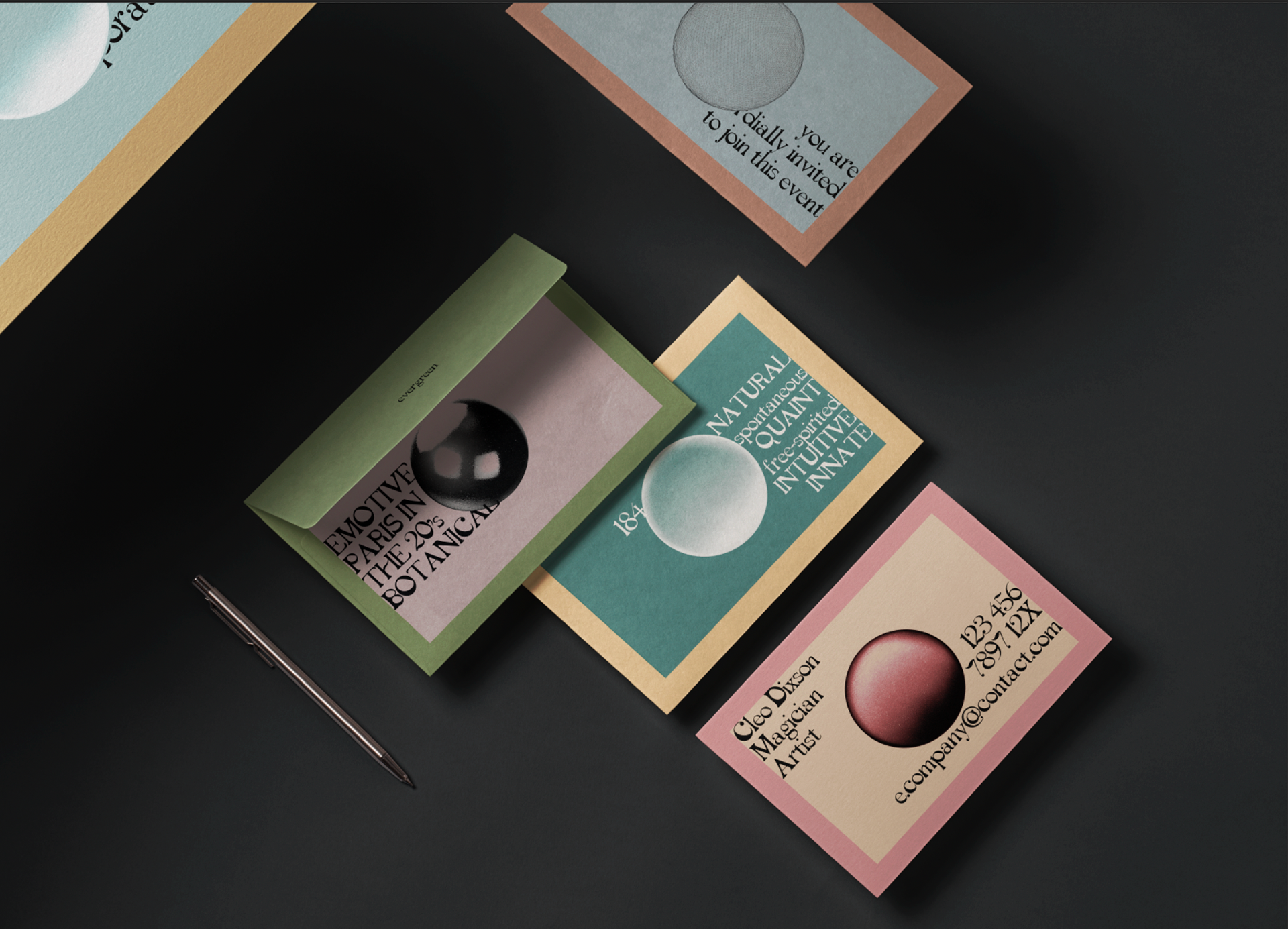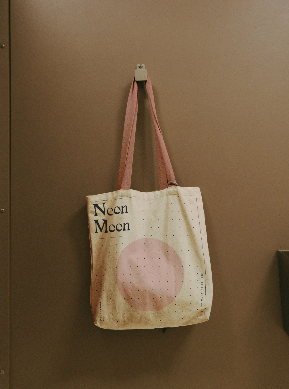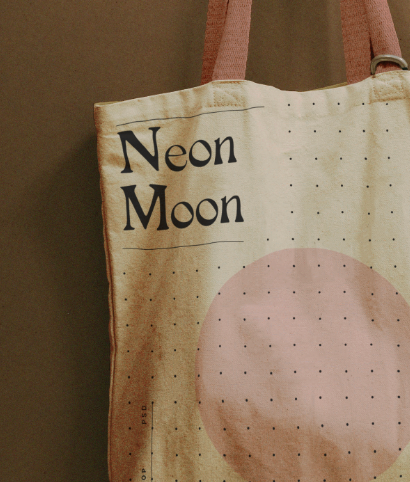
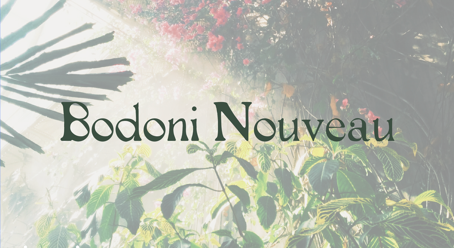
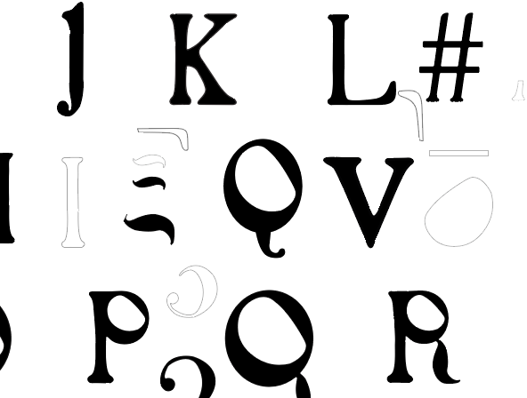
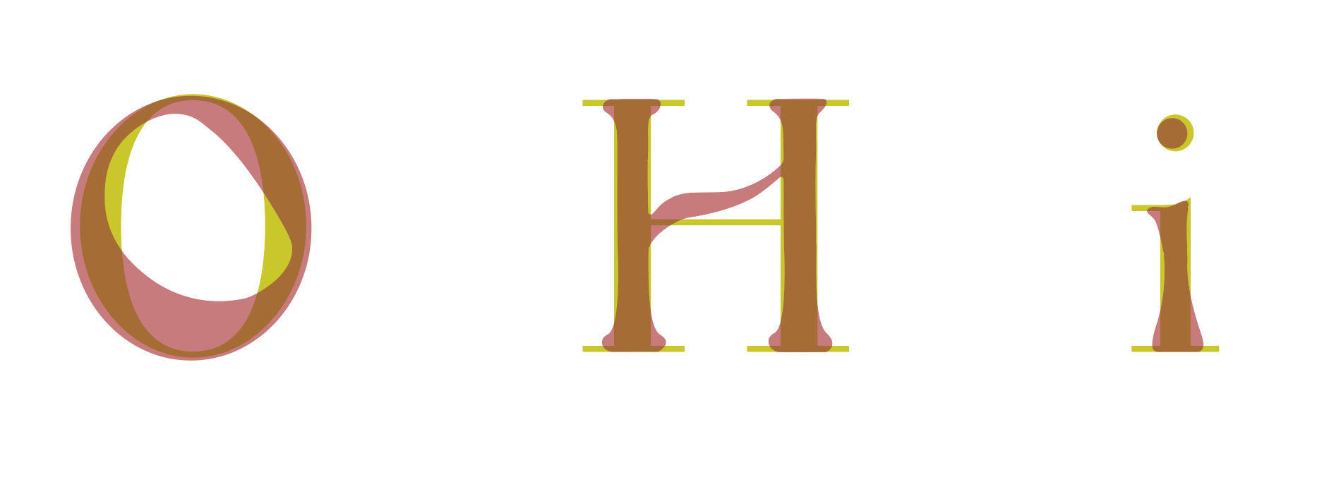
Typeface design
This font was built on the shoulders of Bauer Bodoni. Taking inspiration from the Art Nouveau movement and its emphasis on natural forms and organic shapes. I wanted this font to look hand drawn, to have irregularities in the characters but still maintain a uniformity throughout the entire typeface. The font still has the verticality of Bauer Bodoni, but has less stark contrast between thick and thin and has more curved elements.
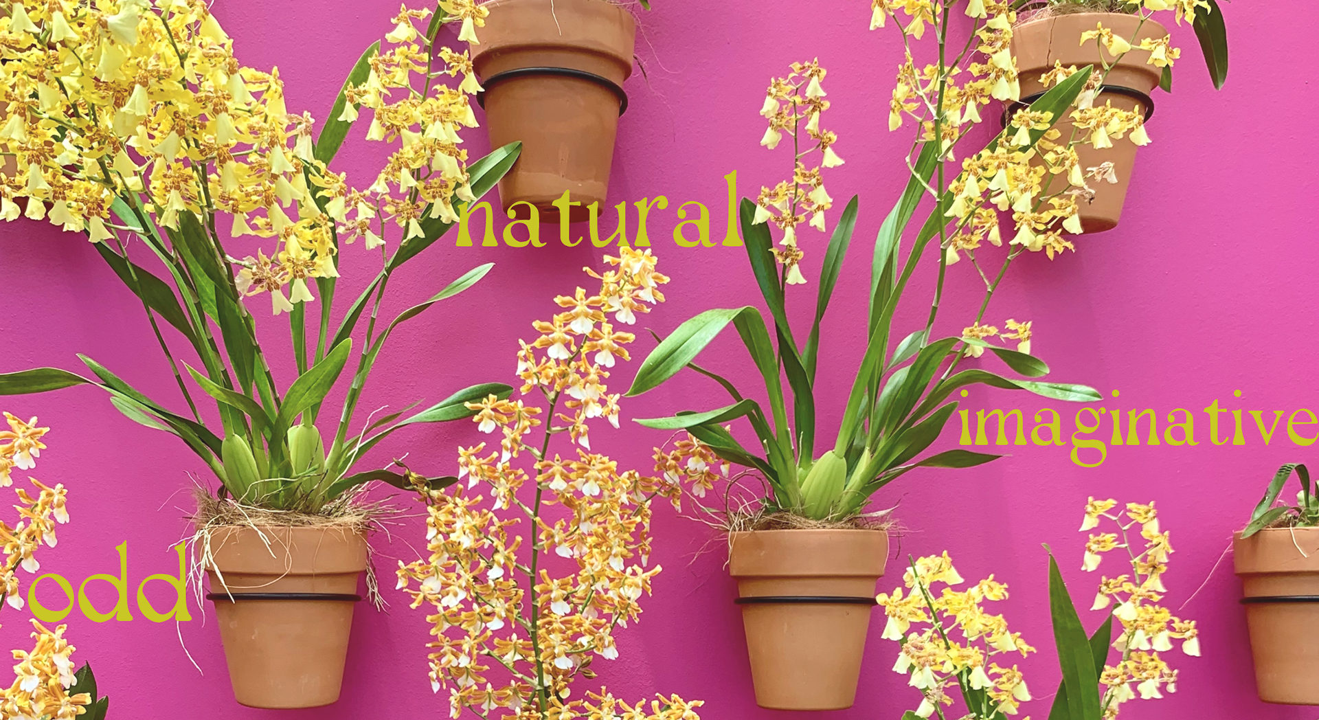
The three main adjectives for this font are, quirky, bespoke and classic. If it had an occupation it would be apothecary shop owner, or perhaps an art museum docent.
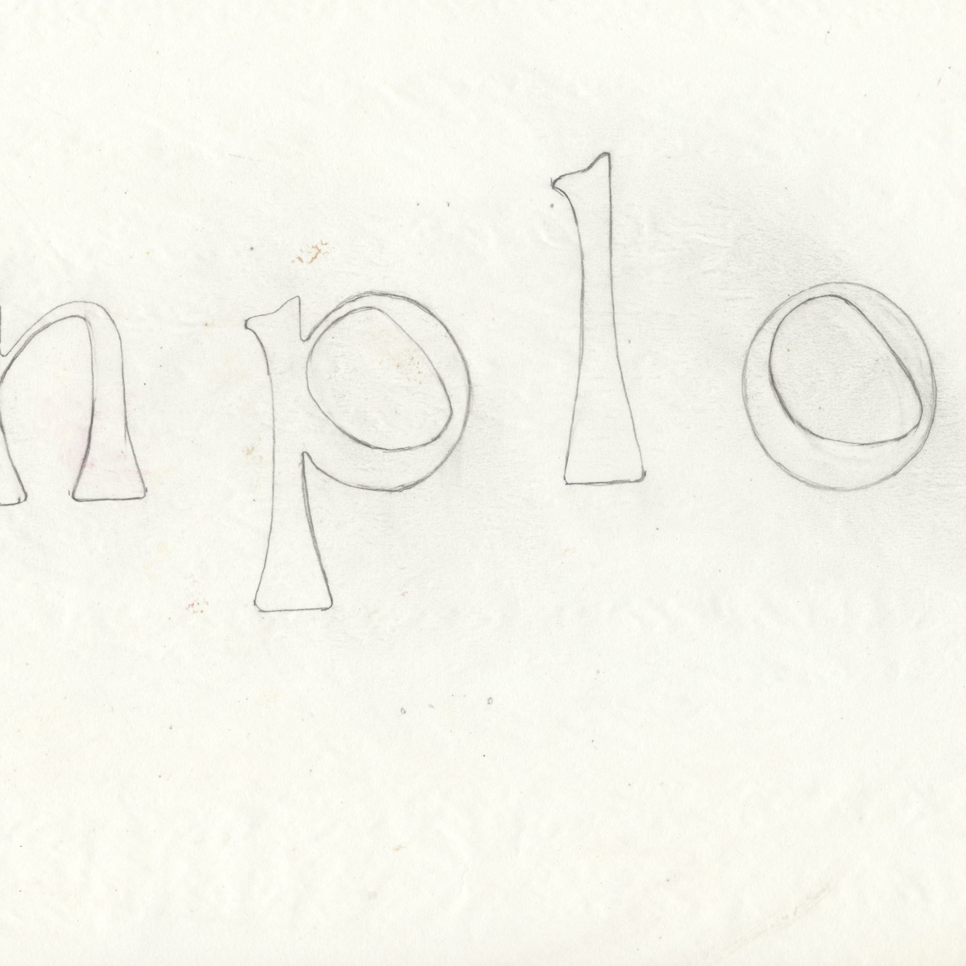
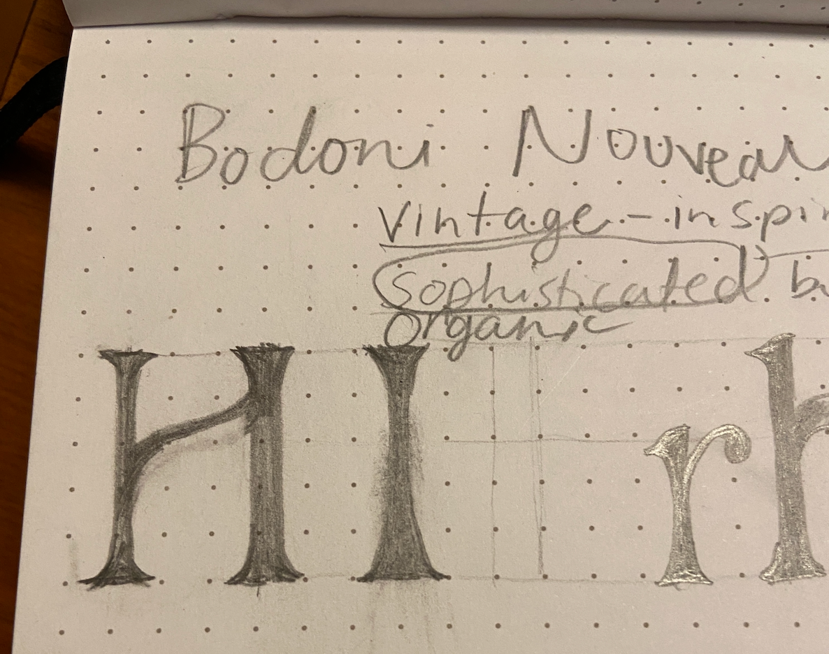
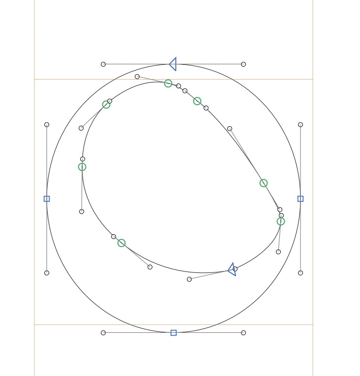
The process of developing this type started with looking at various posters and advertisements from the time period of the Art Nouveau movement. The font was hand-drawn before taking it into a digital formal.